By Nick Pfost
2022 was a milestone year for America’s largest and longest continuously-running conference for LGBTQIA+ college students and young adults, and so our needs for and expectation of our major creative works were as high as ever. Over three decades, tens of thousands have gathered at MBLGTACC—the Midwest Bisexual Lesbian Gay Transgender Asexual College Conference—to learn and grow through the knowledge and experience of their peers and experts. And, in addition to celebrating the event’s legacy and impact, planners prepared for the conference’s fourth decade by introducing the brand new Maker Market and Revoluncheon; reintroducing workshop tracks; creating a reusable signage system for the benefit of future conferences; hosting timely, relevant keynotes from Schuyler Bailar and Imani Barbarin; and more.
On the creative side, some co-existing priorities our team considered were the specialness of the occasion; varying tones, audiences, life cycles, and levels of emphasis among the individual pieces; and conference and Institute brand standards. As a program of the Institute, creative overall makes use of the organization’s brand colors, fonts, and general design sensibilities, while carving out its own clear and unique space through the use of three- and two-color gradients, new design motifs, commissioned art, and a special thirtieth anniversary affinity graphic.
Below, learn more about some of the key deliverables in this suite.
Anniversary mark
Our anniversary mark was a visual symbol designed to commemorate the occasion of the 30th annual conference, complement the brand house overall, and be versatile to its various applications. In lieu of listing the year itself—as has become customary with our "MBLGTACC | YEAR" marks—we chose to highlight the milestone number. In total, it appeared on nearly a hundred unique branded pieces.
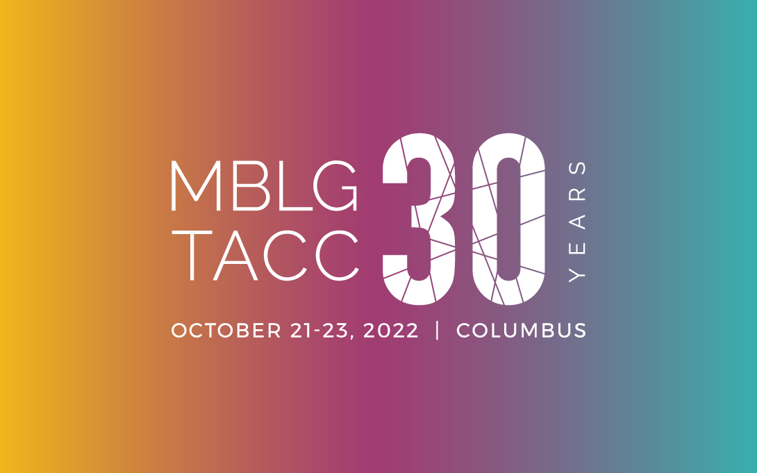
Vertical and color versions were also created and used, featuring the MBLGTACC logo in Midwest Mint, date and location in black, and the "30" treated with the three-color gradient.
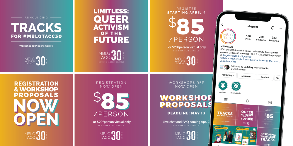
Early announcements
Based on our anniversary mark and direction to incorporate the three-color gradient as a major design theme for this year, we quickly built out a handful of initial graphics for various social media and email pushes. Registration and the workshop RFP were a priority of these first waves of communication.
Workshop track spotlights
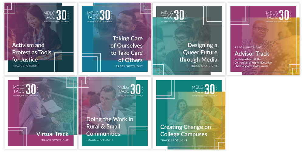
We went big on content theming for the first time this year, with most workshops organized into one of nine tracks. To introduce—to first-time conference goers and repeat attendees alike—both the utility and substance of the tracks, we collaborated on and shared out an informational article on our website, driving content there from email, webinar, and this series of graphics we published to our social media. (Two tracks were added after this suite and the related promotions were completed.)
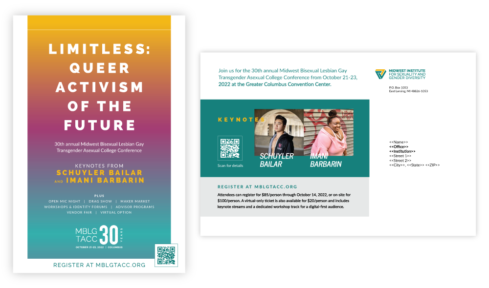
Paid and print advertising
In addition to organic social media outreach, we also sought to widen the contact funnel through paid social media and a promotional postcard to LGBT and multicultural centers across the Midwest.
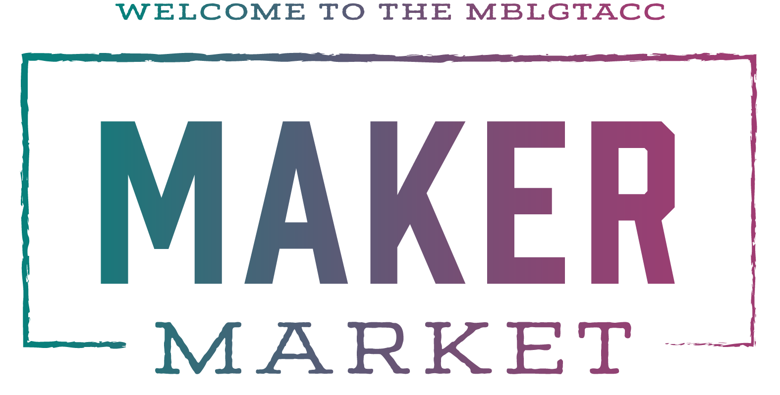
Maker Market
The Maker Market was a new program for 2022, elevating queer and trans makers in the conference space. Our team thought of this space as a queer, in-person, Etsy-like shop and, because of the highly boutique nature of many of those online marketplaces and the character of their shops' logos, we wanted to echo that through a simple graphic mark that we could include in promotions on the website, on social, and in the physical space. For that same reason, we chose to go outside the brand house for these fonts. We used a specific gradient when presenting the Maker Market graphic in color—Midwest Mint and Flyover Fuschia, like other gradients in the suite, both of these are from the Institute's brand colors.
On site
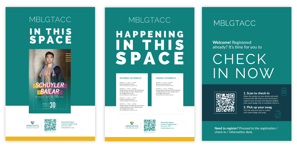
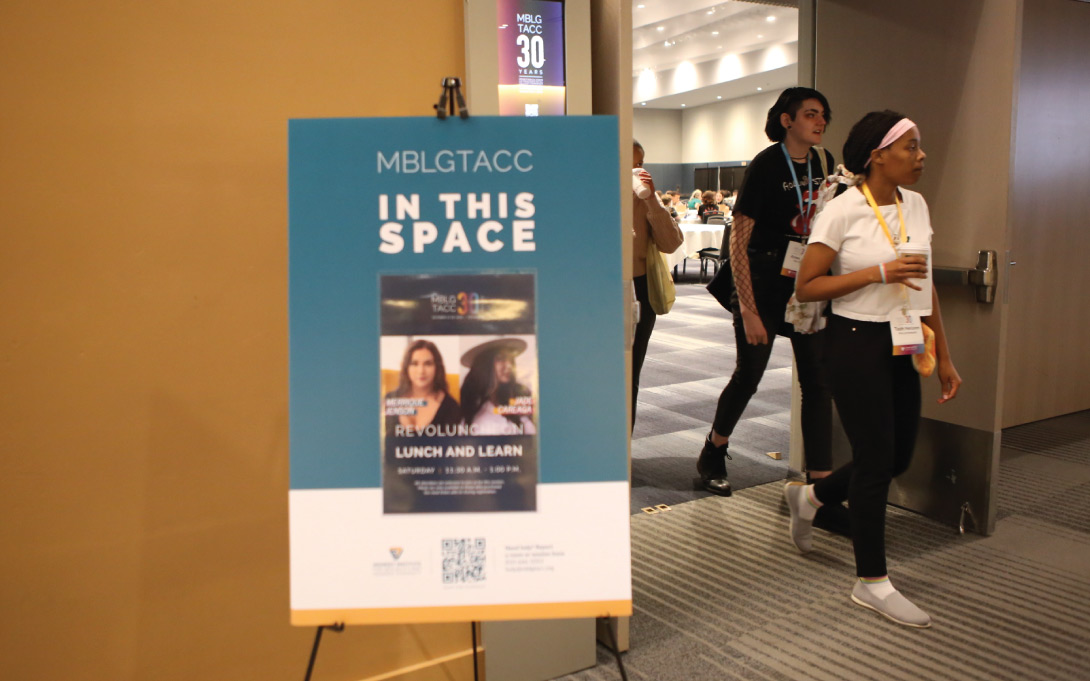
We carried our three-color gradient into the physical space through name badges and signage.
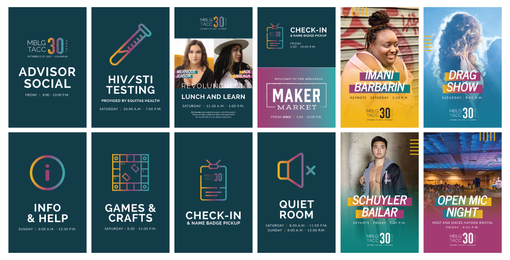
This year, we printed some new 24x36" corrugated plastic signs with clear pockets for us to insert those unique and inexpensive 11x17" posters and 8.5x11" sheets into. We intend for these to have longer life cycles, so we used MBLGTACC/Institute primary colors as a backdrop for the core space, and chose the clear pockets to keep us adaptable to future variation and evolving design sensibilities through annual updates to the inserts.
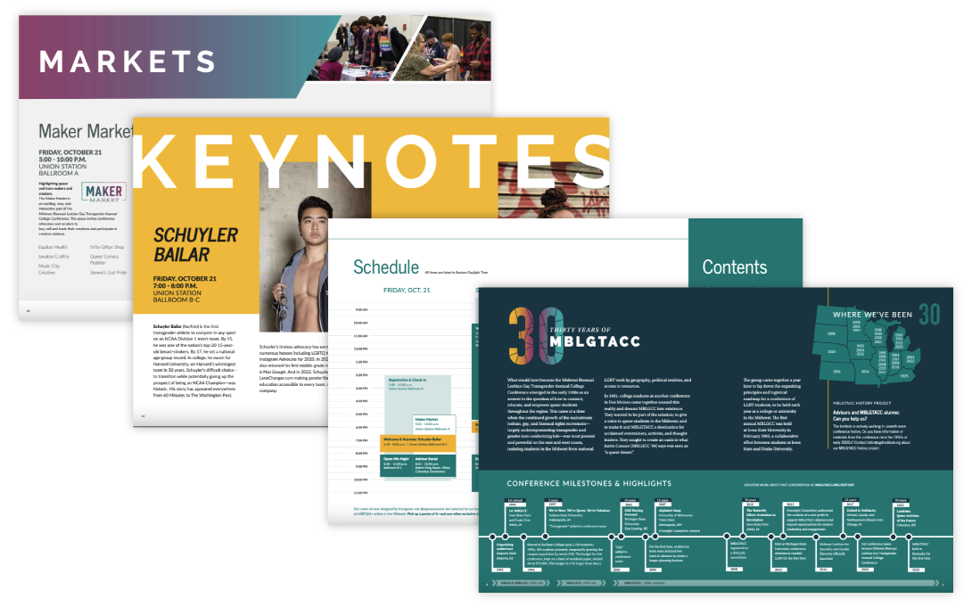
Program booklet
Last—but not least—the program booklet is a commemorative, boutique piece that many attendees hold on to after the conference. I was the creative lead and primary designer for our program booklet, but the cover was designed by Nolan Frank, a young artist from Wisconsin who we commissioned specifically for this purpose.
More
View more MBLGTACC 30th anniversary branding in action on our Facebook and Flickr albums.